First Rule: Please do not post anything pornographic: links, advertisements, or pictures within the C-Box. Do not post anything that disrupts a site such as links in which someone can not click out of.
Second Rule: No Baiting, No Flaming, No Antagonizing, No Trolling, No Spamming, No Changing of Font Size or Color, (Bold, Italic, Underline is fine.) and No Fighting. Keep it English.
Third Rule: Absolutely no advertising within the C Box, failure to do so will result to a perma-band. If you wish to advertise please look into the affiliation boards. Same rule applies to pm advertisements.
Fourth Rule: You may only ask to have bios checked in the Cbox: show Link. Any other Staff requests must be PMed. Do not notify staff you sent a PM in Cbox when dealing with links that cannot be posted in the cbox.
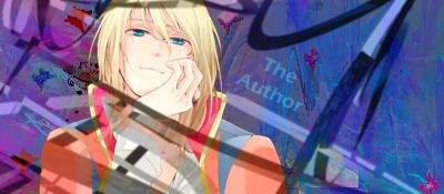
So, I recently got my hands on Photoshop and decided to mess aroudn a bit and make a few simple sigs. Comments and critiques are most welcome, tell me how bad/good you think they are, where I need to improve, etc. etc.
5 out of 5: 2 & 4 4 out of 5: 5 3 out of 5: 1 2 out of 5: None 1 out of 5: 3 [sorry the texture of it doesn't look right. If you udnerstand what I am saying it looks a tad chalky.]
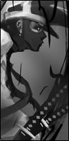
Though your fourth one seems way out of place, the render doesn't really look like it'd fit in hat form of 'enviorment'
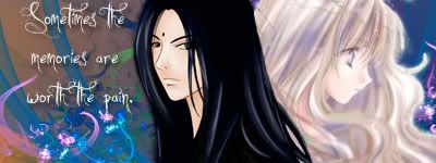
The Miu one isn't really bad at all, though, it coulda been a lot nicer if some work was done on the actual render, as opposed to just the background, but, the background is quiet nice, and the colors seem to go with her outfit some. I can kinda say the same thing for the 2nd one, you coulda worked on the rend some as well, and the background doesn't seem to actually go with the character, though, thats how I see it.
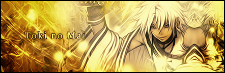
Your fifth ones the best. And your firstones good as well, I personally like how its faded a little, rather then just sticking out.
First of all Hiroko, I made none of those Backgrounds, I simply foudn them and used them, lol. Second, first time using photoshop in about 4-5 years and those are the products of about a total of 30 minutes of work. xD
Terra... Would be nice to know why I'm getting those scores, lol.
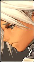
These are real nice. My favorite ones are four and three. Number one is an improvement, though, you kinda destroyed his face, but, the effects aren't bad at all.
The last ones got a great look to it. Instead of the renders being sharp, they're all soft and pleasing to the eyes, while the background doesn't over kill it with the soft, it kinda sets a balance. YOu did real nice with the blur/fuz thing.
The render still feels outa place to me, to be honest.D: Its a step up from before, since you softened up the render a tad bit, but, the background kinda 'contrasts' the character in appearance. Her colors are a little more mellow/darker then bright and flashy. But the purple in the background kinda softens it up slightly because its near the color of her hair, and its a bit constant. So she relates with the background, in a sense.
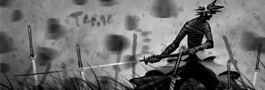
The background makes a bit more sense if you watch the anime. He is the darkness and she is the light, now if you meant the golden thingy, I'm not sure why I added it, just kinda felt right at the time. Meant to put that in the description, but it slipped my mind. xD
And I know you weren't bagging, I was just saying I didn't make the stuff and you were giving me too much credit. xD
And thanks for the reviews.
Last Edit: May 25, 2009 13:15:55 GMT -7 by Takeuchi
o.o Needs work. However, the updated ones seem to be better. The last one I liked. However, most of what I'm seeing is finding a good c4d using it as background. Then placing a render smudging or whatever the sides and then text. That along with a gradient map on some right?


 Thought I'd give the first one another go with some new effects.
 Another one of her.
 Sleepy work! Pretty horrible.
 Latest and my favorite so far.